Scatter Chart

Scatter charts are a powerful way of visualizing the distribution of individual data points in a graph, as well as for spotting possible patterns or relationships in the data by observing how closely the data points are clustered together. The data points in a scatter chart can be colour coded so as to display additional variables in the graph. A scatter chart always has two value axes on the horizontal and vertical axis, and not categories, so as to be able to plot the coordinates of the data points.
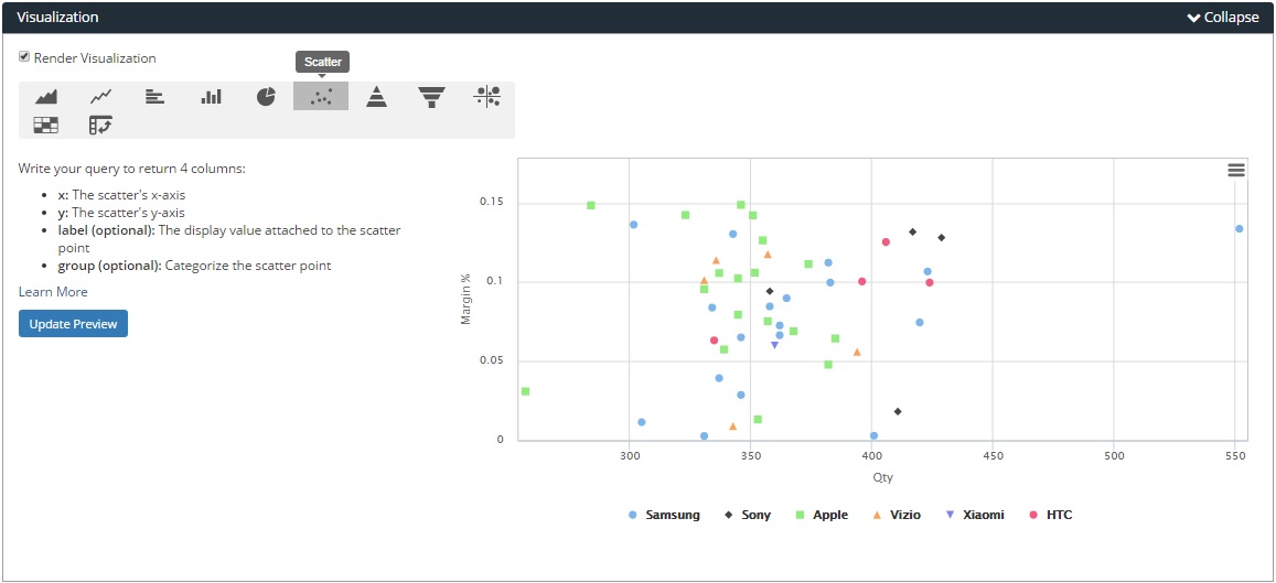
How to Build: Scatter chart
Run your SQL query that returns 2 to 4 columns. The columns of values used for the x and y-axis are required to generate the chart.
In this example, have a look at how we used this data table to generate the scatter chart. We specify the data types of the columns within the 'Format Columns' section of the Report Editor.
- x: The scatter chart's x-axis, which is the ‘Qty‘ column for quantity, which uses the number data type.
- y: The scatter chart's y-axis, which is the ‘Margin %’ column for profit margins, which uses the number data type with 'Percent' as the format for percentage values.
- label (optional): The ‘prod_name’ column values attaches the product name label to each of the scatter chart’s individual data points, using the string data type.
- group (optional): This column categorizes and colour codes the scatter points by their grouping, which is by phone product company's brand in this example based on the ‘prod_brand’ column, which uses the string data type.

Access the Visualization Editor at the bottom of the Report Editor screen, and select the 'Scatter' chart option button. If you have built your SQL query correctly to return the necessary columns, Holistics will then plot the data columns as a scatter chart, as per this example.