Visualizations
List of some of the most common visualizations and chart types used in Holistics:
- Line Chart
- Area Chart
- Bar Chart
- Column Chart
- Pie Chart
- Scatter Chart
- Bubble Chart
- Pyramid Chart
- Funnel Chart
- Cohort Retention Table
- Pivot Table
- Geo Heatmap
- Conversion Funnel
- Chart Settings
Building Charts in Holistics
Go to Query Editor by clicking on Analyze in the navbar:
Once you enter the query editor, you can type any quick SQL query and click Run to pull up the dataset you require.
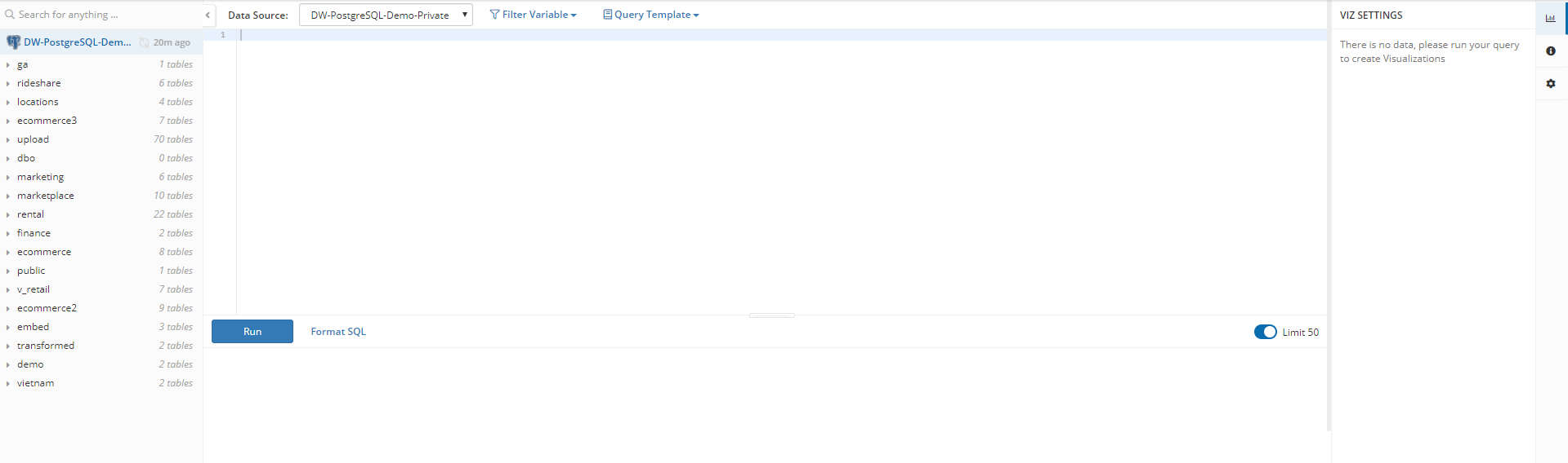
In this example, we'll use:
select * from ecommerce.orders
This will return your chosen data table to you.
You're now ready to build some visualizations!
Select the visualization type from the chart dropdown menu at the bottom:

Aggregations/Transformations on Charts
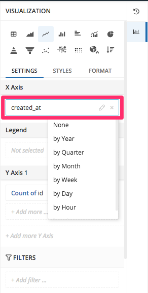
Date Transform
For Date/Time fields, you can transform these directly to the groupings you want, such as by Hour, Day, Week, Month, Quarter or Year.
In tab Settings, under section X Axis, click on the date-typed column you want to transform and pick one in the dropdown:
Data Aggregation
With the aggregation feature, you can quickly apply functions to perform calculations on your data series, to display on your charts.
Aggregation Types:
- Sum
- Average
- Max
- Min
- Count
- Count (Distinct)
- Median
- Sample Std. Dev.
- Sample Variance
- Population Variance
In tab Settings, under section Y-axis, click the series you want to aggregate pick one in the dropdown:

Filtering on Charts
This feature allows you to easily customize charts to get the specific results, for easier data exploration.
In this example, the chart's filter has been set to display data values that match the condition where Status equals to Waiting Payment, and the date values of the column Created At fall between 2016-03-01 and 2016-07-01:

In tab Settings, under section FILTERS, click Add Filter and select the column value you want to specify:

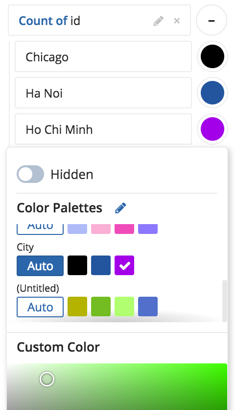
Color Pickers for Charts
Holistics chart colors customization allows you to define your preferred color palettes, colors for individual data series on your charts, the specific HTML color codes you want, and more!
Color picker for single y-axis or series
Click on the color wheel to the right of your chosen Y Axis 1, and modify the color settings:

Color picker for all Charts
Do you have a preferred set of colors, or perhaps a required color palette for company branding purposes? Simply choose to edit your color palettes by navigating your way to the Colors tab of the Admin Management
Then select New Palette to begin adding and modifying your chosen colors for this palette set, and save this palette:

You can then return to your charts visualization Settings, and by selecting the Auto button for your new color palette, your chart will then utilize the colors that you set!
Set Column Type Format
This allows you to easily configure the data types of the series on your chart. This allows you to modify the types of treatments you can apply to your underlying data, so as to perform specific functions that depend on having the correct data type assigned (e.g. dates, numbers, text strings etc.).
To set them, choose tab Format and set the wanted type for your column:
